New Logo & Identity By Fisk Studio

About
Founded in 2017, Spin Control designs the freshest gear that helps dancers take their skills to the next level. Since the launch of our first piece, The Premium Spin Cap—one of the first breakdancing products ever created, we’ve dedicated our company to pushing breaking culture forward through innovative products, knowledge distribution, and collaboration.
The Old
Our previous logo represented what we imagined bboys and bgirls would be capable of doing using our product. Each circle represented a spin, and each color represented a change in movement viewed from above. As support for our brand grew from local to national, and from national to international, we realized that we could be doing more for our global community.
The New
Our current logo represents our expanded growth and vision at Spin Control. The creative process with Fisk Studio was rooted in breaking, as the designer himself is a bboy with a masters in graphic design. The logo preserves the circular feel of the original, but brings stability to the brand with a less busy and more immediately recognizable design.


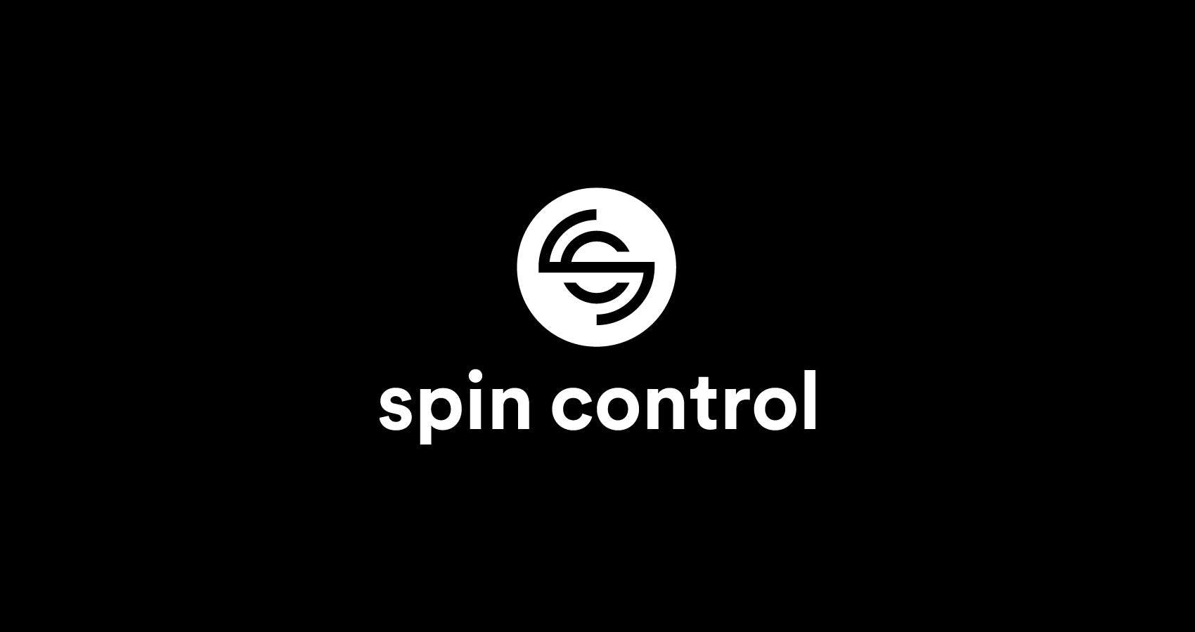
The Details
With a closer look, the new design portrays the spin motion thanks to a clever use of negative space. While maintaining the point of view from our previous logo, the “s” represents the legs of someone doing a head spin, while the “c” shows the shape of the arms. This contemporary redesign is a homage to our first product and a strong foundation for moving forward as the Spin Control brand grows.
